About the project
Studio22 is an independent barbershop based in Hitchin, Hertfordshire, founded by owner Matt Andrews with a simple goal: provide exceptional cuts and service, build a loyal client base, and create a secure future for his family. After three years in business, the shop had grown steadily by word of mouth and online reviews, but the brand itself hadn’t kept pace with its reputation or ambitions. With plans to move into a larger space in Hitchin and eventually expand to Letchworth and Stevenage, Studio22 needed a more defined identity – one that felt more upmarket and confident, while still being friendly, accessible, and rooted in the local community.
The challenge was to create a brand that could sit comfortably between traditional barbershop heritage and a more modern, studio-like feel. The owner’s personality—straight-talking, hard-working, and genuinely customer-focused—also needed to be reflected clearly in the visual identity and tone of voice. Alongside this, we needed to consider the shop’s growing appeal to all ages and its emerging focus on SEN haircuts, ensuring the brand felt welcoming, inclusive and trustworthy, without becoming soft or generic.
The solution
Starting with a full brand strategy, we defined Studio22’s positioning, audience personas, competitors, and core values. From there, we clarified the brand’s promise: exceptional cuts, no-nonsense service, and a long-term commitment to its community. This work informed a clear tone of voice centred on being “the straight-talking pro”, confident, grounded and dependable. We then explored how Studio22 could visually distinguish itself in Hitchin’s crowded grooming scene, particularly against more trend-driven or aggressively premium competitors.
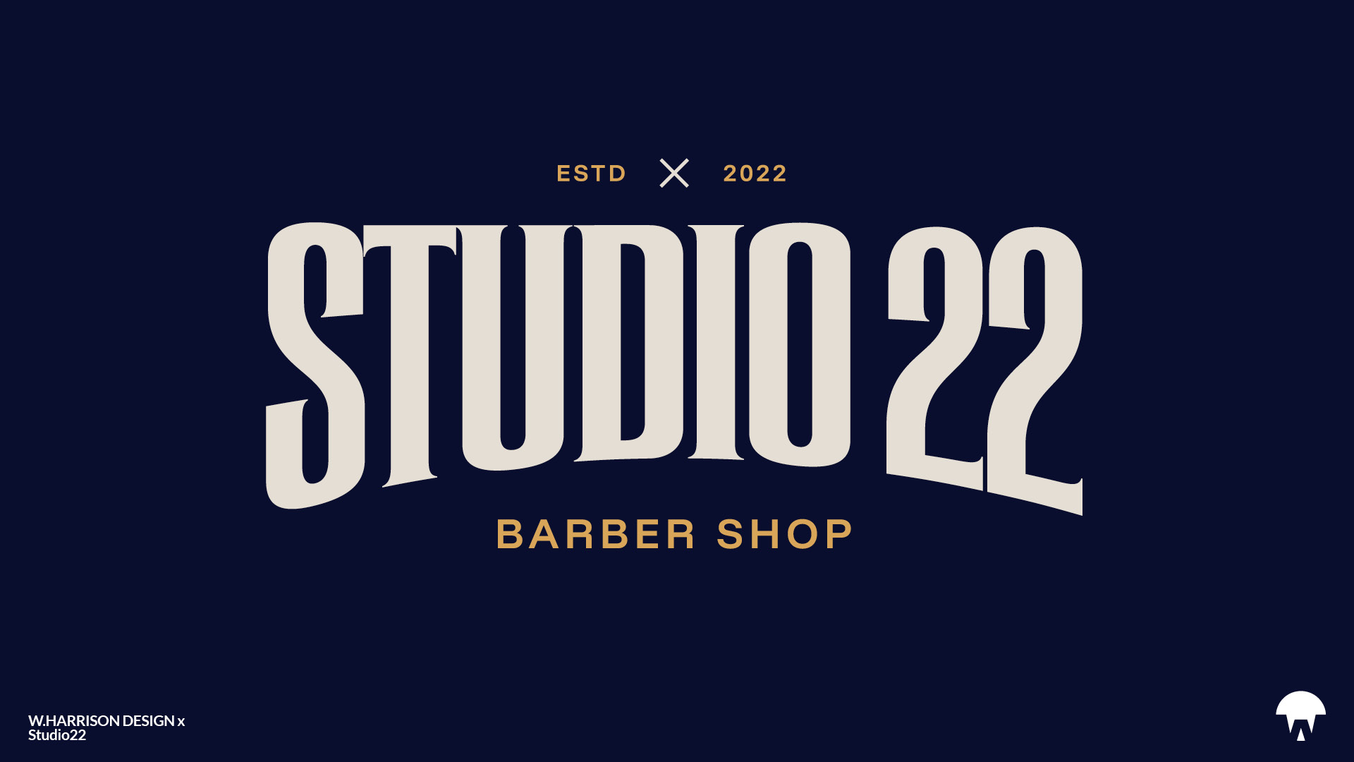
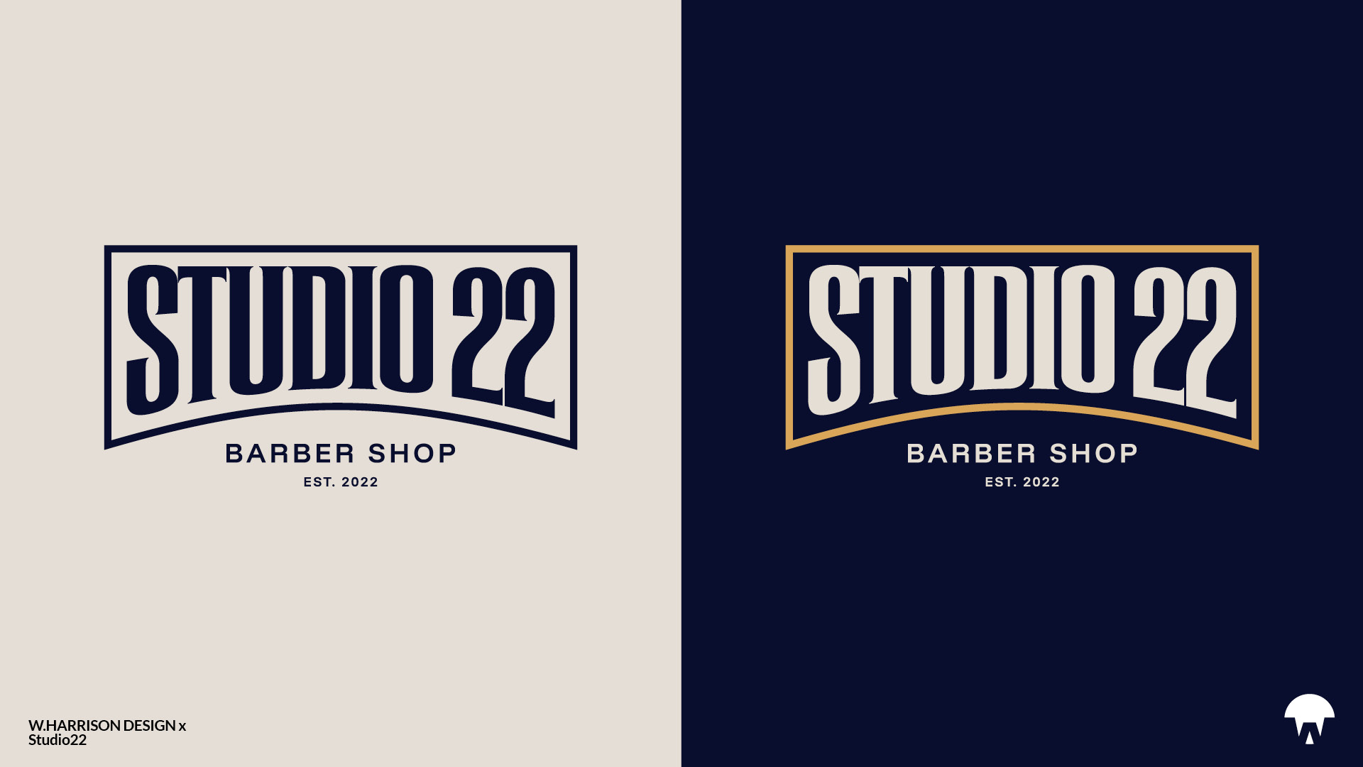
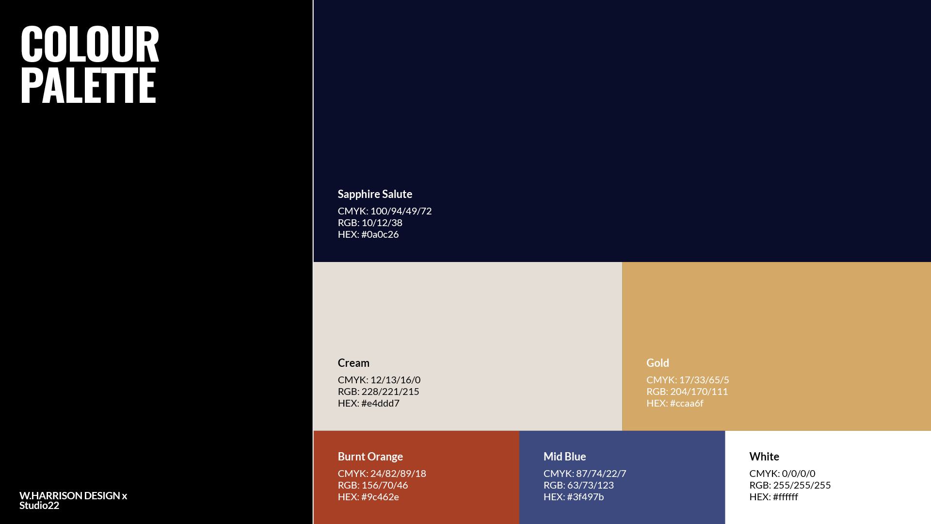
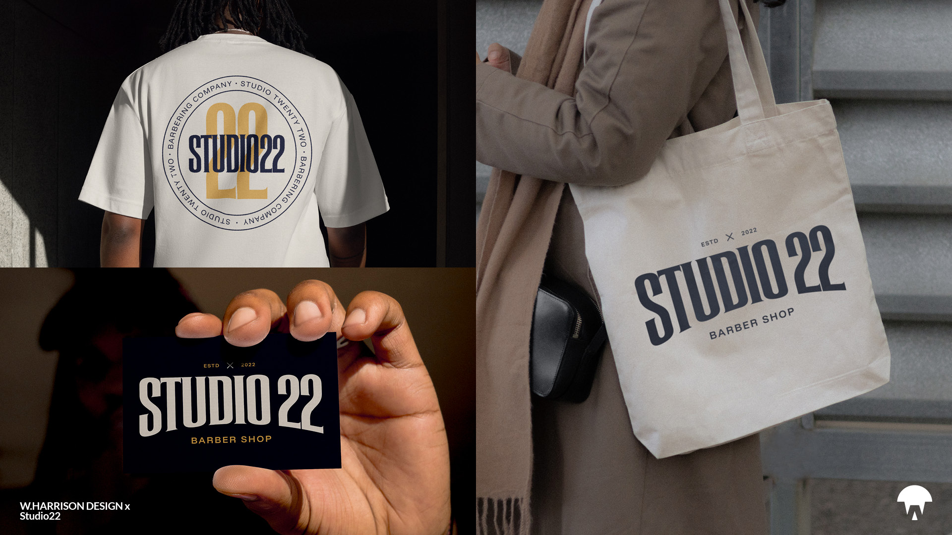
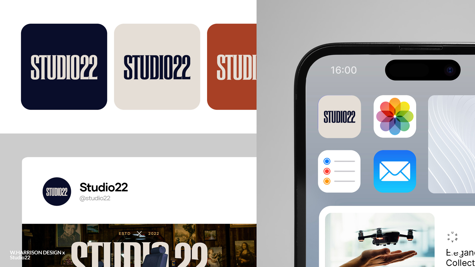
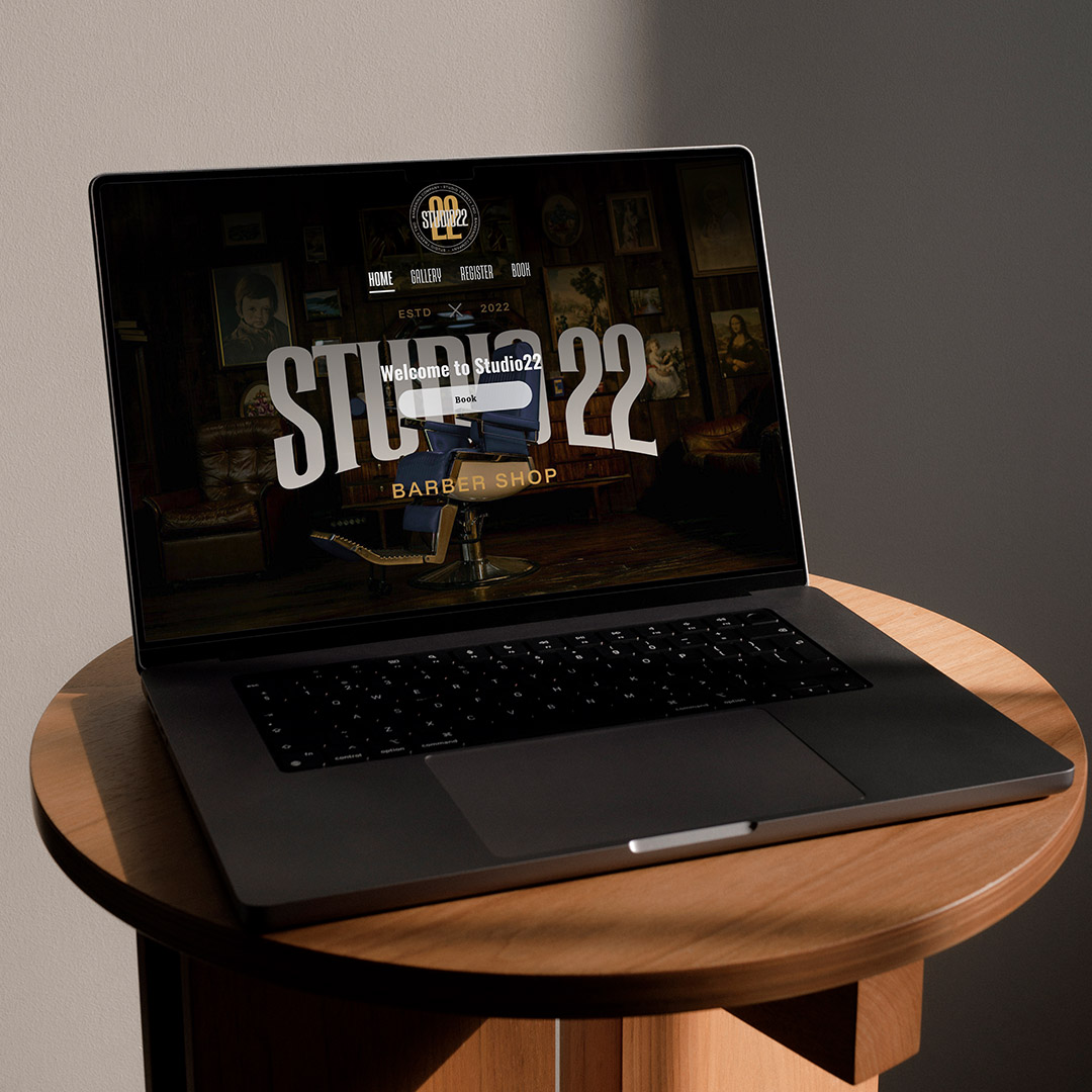
The visual identity centres on a bold, authoritative wordmark. A strong, industrial-inspired typeface that nods to traditional barbershop lettering while feeling modern and dependable. The tall, confident forms give Studio22 an unmistakable presence, creating a sense of trust, heritage, and craft. Alongside the wordmark, a circular badge lockup was developed, pairing the bold typography with a large “22” to form a timeless emblem that feels instantly established and reputable. The combination of deep midnight blue and warm gold reinforces a premium yet grounded aesthetic, while the overall system is designed to feel authentic, masculine, and rooted in the legacy of classic barbering. This visual direction ensures Studio22 stands out in a crowded local market, projecting strength, honesty, and a level of professionalism customers can rely on.
Results
The outcome is a distinctive, scalable identity that finally matches Studio22’s ambition and reputation. The combination of a smart, meaningful logo, confident typography and a strong colour palette positions the shop as a cut above generic high-street barbers, while still feeling approachable and grounded. The brand now clearly communicates what makes Studio22 different: consistent quality, genuine service, and a clear long-term vision.
With a defined strategy, visual system and tone of voice in place, Studio22 is better equipped to attract new clients, retain loyal regulars, and move towards its goal of expanding into larger premises and additional locations. The identity gives the owner a professional platform to build on, supporting everything from in-shop experience and signage to digital presence and future marketing campaigns, while staying true to the straightforward, family-focused values at the heart of the business.


